Hopki:
Thanks a lot for replying...
I've got a couple of questions:
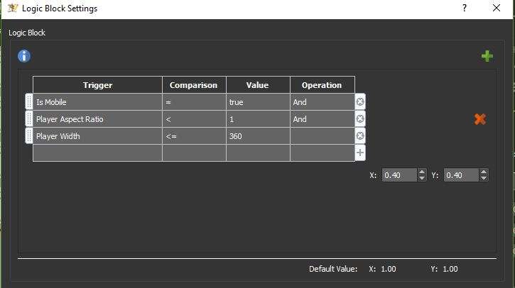
the scale logic block, player width bigger than 800...why not use 360?..i though 360 was the size of the screen of a mobile phone..
SO instead of applying the previous rules that I was using for the map (is Mobile, player aspect ration and player width)..can I apply this same rule for the responsive map? (just player width)??
I'm having a bit of an issue:
With the template that you provided, I modified a bit the size of the text bag...I made it a bit bigger...
When I see the output in my desktop, this is what I see:

When I see the output in my phone, this is what I see:

I can scroll the description in the phone, but barely i am able to see two lines
With the template you submitted without any modification, I was having the same behaviour as the current behaviour that I have in my phone, but it was the same in the desktop and in the phone...
Is there anything that I am not doing right?
Just attached the skin with the minor modifications I did..in case you want to see it

